Sunday, September 30, 2007
Modeling Phil
Started modeling Phil. I started with a straight bulb first. I'll work out some of the texture issues then I'll "push" his shape more.
Here are is first render:
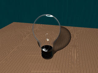
You can see that the refraction is way too high, the bulb is blocking it's own shadow!
I'll have to fix that and then work on adding in the filament (what will be his mouth).
Here are is first render:

You can see that the refraction is way too high, the bulb is blocking it's own shadow!
I'll have to fix that and then work on adding in the filament (what will be his mouth).
Sunday, September 23, 2007
References
I did a bit of research this week, and found the sites that everyone seems to know about already. Well, better late than never.
Here are some of the sites I have been using for reference:
http://highend3d.com/ - this site has a lot of great tutorials and some things you can download, like shaders that make it a bit easier to get started.
http://www.spafi.org/index.php - this site has some good tutorials as well. There was a good one about creating a glass shader that should be really helpful for Phil.
I also got around to reading some of Keith Lango's blog/site. Awesome animation tutorials on here.
I paid particular attention to how he has updated the tutorials over the years. That's a hard thing fro me to remember. We are always growing and learning. Even the guys who seem to have it figured out, are learning. That's what keeps them working and great I guess. The reversal of position on adjusting the keyframe pose timings in the dope sheet, to his current view of creating more keyframes is a good example. This actually fits my intuition as well. Get it as close as you can at first, then tweak. It's a hard impulse to resist: I'll just fix it later...well maybe, but it's probably going to be a lot harder. I've learned this in recording music over the years. Better to do another take than try to fix it in the editing!
Sunday, September 16, 2007
2D Animatic
Worked on the 2D Animatic today. I imported all the screenboard drawings that Andrew made into Sony Vegas Video. I also did some photoshop editing to remove Phil from the background to make it easier to "animate" a couple of the shots. Here is the final draft. I had to rearrange the story a little bit as it wasn't possible to get the timing to flow smoothly with only 15 seconds using the original idea. I made Phil ignore the fly instead of reacting strongly. I think it makes for a better ending and it shaves some time off Phil settling himself for the ending.
I think this is pretty close to what the final timings should be. It's a little difficult to know for sure of course without a 3D Animatic, but that comes next. This was a very interesting process, as it made it very, very clear whether or not the timings were going to work. It also made it obvious that the sound was going to be very important, especially as there is no dialog. The sound in the animatic is not the final sound. It's just a trial run to feel out what kind of sounds might work, and what is needed to add believability to the scene. When we create the final animation we will need to redo the final sound design.
I think this is pretty close to what the final timings should be. It's a little difficult to know for sure of course without a 3D Animatic, but that comes next. This was a very interesting process, as it made it very, very clear whether or not the timings were going to work. It also made it obvious that the sound was going to be very important, especially as there is no dialog. The sound in the animatic is not the final sound. It's just a trial run to feel out what kind of sounds might work, and what is needed to add believability to the scene. When we create the final animation we will need to redo the final sound design.
Saturday, September 15, 2007
Rigging, the reprise
Worked on rigging the BoxCar character Will made for us today. That was quite interesting. It's fairly easy and straight forward to create the joints and bind them to the skin. Although I did have some weird behaviour with the Eyes. I don't think I bound them to the right thing. When I moved the head the eyes moves into or out of the head. I'll have to keep working with that.
Painting weights on the skin is quite time-consuming however. It's a bit of a pain to get the joint to only affect the parts you want especially feet that are close together and so on. Sometimes the hip joint moving will make the feet CV's move, but it's not the hip joint doing it, but the knee say, which is being moved by the hip and then moving the foot which has some weight assigned to the other foot. Bit fiddly to get it to let go, but it can be done with some time and attention. I got BoxCar to move fairly well, except his eyes. Must sort that out.
The Maya Mastering book is really a helpful resource. It's chock full of tutorials. Makes life a lot easier. Here is a render of BoxCar in a pose after rigging.
Worked out the issue with the eyes. The eyes group was grouped to the wrong thing. That's a relief. Here goes the render.
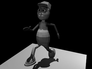
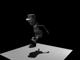
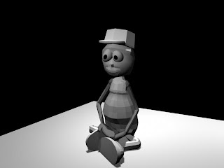 The poses aren't quite right, but it shows that the rigging works fairly well. More painting needed in the chest and belly area on the sitting pose and second jumping pose. But not bad for a start.
Painting weights on the skin is quite time-consuming however. It's a bit of a pain to get the joint to only affect the parts you want especially feet that are close together and so on. Sometimes the hip joint moving will make the feet CV's move, but it's not the hip joint doing it, but the knee say, which is being moved by the hip and then moving the foot which has some weight assigned to the other foot. Bit fiddly to get it to let go, but it can be done with some time and attention. I got BoxCar to move fairly well, except his eyes. Must sort that out.
The Maya Mastering book is really a helpful resource. It's chock full of tutorials. Makes life a lot easier. Here is a render of BoxCar in a pose after rigging.
Worked out the issue with the eyes. The eyes group was grouped to the wrong thing. That's a relief. Here goes the render.


 The poses aren't quite right, but it shows that the rigging works fairly well. More painting needed in the chest and belly area on the sitting pose and second jumping pose. But not bad for a start.
Thursday, September 13, 2007
Kung Fu Hustle
Kung Fu Hustle is a great martial arts film that uses lots of animation and compositing. So many of the scenes use 3D. The head of the animation firm that did the special fx said there were aproximately 100,000 man hours involved. Meaning that if only one person had to do it all it would take them about 35 years, working 55 hours a week. But the result is spectacular. Here a few shots from a wonderful scene where assassins use a musical instrument to conjure skeleton warriors:
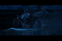
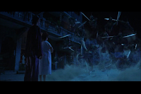
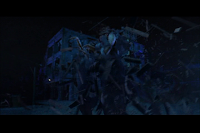
[screenshots from Kung Fu Hustle by Stephen Chow]


[screenshots from Kung Fu Hustle by Stephen Chow]
Tuesday, September 11, 2007
The Art of Rigging
A whirlwind tour tonight on the art of rigging. We quickly (and I mean quickly) covered rigging with joints and bones, using Forward and Inverse Kinematics. We also looked at animating the camera using paths and editing those paths to play with its movement. This will be very useful stuff in our animation, as we have a sequence where we will animate the camera from the point of view of a fly buzzing around Phil's "head".
Our 2D animatic is due next week, so lots more drawing ahead, as well as scanning them in and using Sony Vegas to nail down the timings and give them some "animation" quality.
Our 2D animatic is due next week, so lots more drawing ahead, as well as scanning them in and using Sony Vegas to nail down the timings and give them some "animation" quality.
Monday, September 10, 2007
Thoughts about creating Phil
Using lattice deformers should make it fairly simple to create Phil's bulb using a simple sphere. The tricky part is going to be his glowing filament and the glow overall, not to mention his glass bulb. There are a few tutorials around though for creating glass in Maya online, and in the Mastering Maya 8.5 which was a good buy for sure.
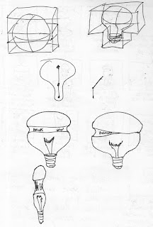
[thoughts on using lattice deformers]

[thoughts on using lattice deformers]
Saturday, September 8, 2007
Working on the Character Dossier
Notes for the Character Dossier:
We settled on Phil Bulbman (as in Philips bulbs, ha!)
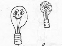
He's a 60W (not real bright) light bulb (still debating whether or not he's clear or soft-white).
Occupation: Lighting
Eyes: Black text - "Philips" and "60W"
Marital Status: Single
Lives: New York City Apartment, 3rd floor, 2BR
Height: 100cm (big bulb!)
Base: Shiny metal (alum)
Age: 35
Personality: Impatient
He's jealous of CCFL (high-efficiency) light bulbs, so he is trying to better himself through meditation. After 15 years in NYC he is losing his brightness and is trying to regain it. He's feeling a little "burned-out" from working so hard to a make a living in NYC. He moved to NYC to find a better life and experience the big city. He was born and raised in Alburnett, IA (pop. 559). Sick of living in a small town with nothing to do so he moved to NYC to experience more things. Trying to make himself patient so he can make friends and find a girlfriend.

Notes about the environment:
- Bedroom (2nd)
- cushion to sit on
- carpeted floor
- altar: buddha statue, picture, candle
- Posters on the wall: Thangka, japanese painting
- bookshelf with books
- window with light coming in
General Notes:
It has been quite enjoyable coming up with the fictional life of Phil Bulbman. Andrew and I have had a lot of fun. We seem to work well as a team, both bringing ideas to the table and hashing them out without drama. He seems keen on the project, which is good as we have quite a bit of work ahead. We need to clarify our specific roles as we go ahead with the project.
I have been using a free program called celtx, available on the net. It helps do pre-production. It has been handy for organizing our ideas and collaborating over the web.
We need to get our storyboard sorted soon and loaded into celtx as it is due on the 11th.
We settled on Phil Bulbman (as in Philips bulbs, ha!)
He's a 60W (not real bright) light bulb (still debating whether or not he's clear or soft-white).
Occupation: Lighting
Eyes: Black text - "Philips" and "60W"
Marital Status: Single
Lives: New York City Apartment, 3rd floor, 2BR
Height: 100cm (big bulb!)
Base: Shiny metal (alum)
Age: 35
Personality: Impatient
He's jealous of CCFL (high-efficiency) light bulbs, so he is trying to better himself through meditation. After 15 years in NYC he is losing his brightness and is trying to regain it. He's feeling a little "burned-out" from working so hard to a make a living in NYC. He moved to NYC to find a better life and experience the big city. He was born and raised in Alburnett, IA (pop. 559). Sick of living in a small town with nothing to do so he moved to NYC to experience more things. Trying to make himself patient so he can make friends and find a girlfriend.


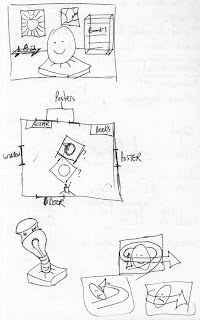
Notes about the environment:
- Bedroom (2nd)
- cushion to sit on
- carpeted floor
- altar: buddha statue, picture, candle
- Posters on the wall: Thangka, japanese painting
- bookshelf with books
- window with light coming in

General Notes:
It has been quite enjoyable coming up with the fictional life of Phil Bulbman. Andrew and I have had a lot of fun. We seem to work well as a team, both bringing ideas to the table and hashing them out without drama. He seems keen on the project, which is good as we have quite a bit of work ahead. We need to clarify our specific roles as we go ahead with the project.
I have been using a free program called celtx, available on the net. It helps do pre-production. It has been handy for organizing our ideas and collaborating over the web.
We need to get our storyboard sorted soon and loaded into celtx as it is due on the 11th.
Labels: 3d, animation, Character Dossier, ideas
Working out the storyboard. Here are some sketches I did as an experiment before meeting with Andrew:
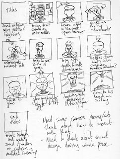
It really helped to do a quick sketch like this to work out how the story should go, and to think about the timing of the action. It also really helped to see how moving the camera could create effects, and affect the action.

It really helped to do a quick sketch like this to work out how the story should go, and to think about the timing of the action. It also really helped to see how moving the camera could create effects, and affect the action.
Thursday, September 6, 2007
Sketching ideas for 3D Animation Project
Some ideas for the 3D Animation project:
Meditator walks into his meditation room.
Sits on a cushion. Tries to meditate.
Disturbed by noises outside, a fly etc...
Finally gets it together. Starts to levitate, and glow and bumps his head on the ceiling.
The End.
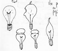
The main character could be a bulb. That might add a humorous element especially with the glowing. The bulb could be clear or frosted glass, depending on how hard it is to make it clear. We could use the filament as the mouth to allow the bulb to show some expression.
Not sure how to do the eyes? Indented? Use printed text on bulb for prints? Maybe one big eye that goes all the way around? The whole thing blinks!?
Reference images:

[This is a light bulb model I found on Turbo Squid.]
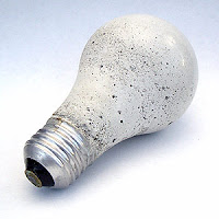
[image courtesy of finkbuilt.com]
This is a great example of a frosted bulb with flaws, which would go well with our flawed meditator. This one is actually made out of concrete, pretty cool idea.
Meditator walks into his meditation room.
Sits on a cushion. Tries to meditate.
Disturbed by noises outside, a fly etc...
Finally gets it together. Starts to levitate, and glow and bumps his head on the ceiling.
The End.
The main character could be a bulb. That might add a humorous element especially with the glowing. The bulb could be clear or frosted glass, depending on how hard it is to make it clear. We could use the filament as the mouth to allow the bulb to show some expression.
Not sure how to do the eyes? Indented? Use printed text on bulb for prints? Maybe one big eye that goes all the way around? The whole thing blinks!?
Reference images:

[This is a light bulb model I found on Turbo Squid.]

[image courtesy of finkbuilt.com]
This is a great example of a frosted bulb with flaws, which would go well with our flawed meditator. This one is actually made out of concrete, pretty cool idea.
3D Animation Project - 15 second animation
Well, we have received our instructions for the second 3D project: create a 15 second animation from scratch including storyboards, character dossier, 2d animatic, 3d animatic, and finally animation.
Labels: 3d, animation, logbook
Subscribe to Comments [Atom]